Color Psychology at Home: How Warm and Cool Tones Quietly Set the Mood
By Home Moon
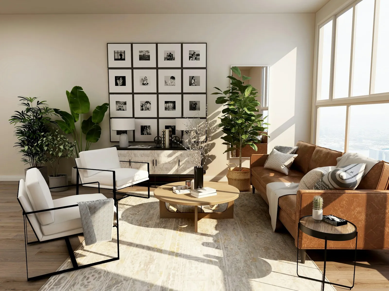
Photo: Unsplash
You walk into a room and you feel something before you have noticed a single object. Cozy or crisp, calm or lively, welcoming or a little cold. A surprising amount of that first impression is color, working on you before your thinking brain catches up. Once you learn how warm and cool tones behave, you can steer the mood of any room on purpose.
Warm colors pull a room in, cool colors open it up
This is the oldest lever in decorating. Warm tones like reds, oranges, terracotta and honey yellows feel close and cozy, and designers describe them as advancing, seeming to step toward you. Cool tones like blues, greens and soft greys feel airy and calm, and they seem to recede. So a warm color makes a large, echoey room feel intimate, while a cool color helps a small room breathe. You are not changing the size of the room, you are changing how it feels to stand in it.
Room by room
- Bedroom. Soft, muted tones almost always win here. Warm neutrals and dusty rose lean cozy and romantic; pale blue and sage lean toward calm and rest. Keep the saturation low so the room soothes instead of buzzing.
- Kitchen and dining. Warm tones are the classic choice, since they read as social and welcoming around a table. A warm wall or warm wood tones make a meal feel like an occasion.
- Home office. Greens and gentle blues tend to feel steady and easy on the eyes through a long stretch of focus, which is why they show up so often in workspaces.
- Bathroom. Cool, clean tones read spa-like and fresh. Add one warm accent, a wood stool or a brass fixture, so the room feels restful rather than chilly.
Light decides how a color actually reads
Paint is a bit of a liar until you see it in your own light. A warm bulb pushes every color toward yellow and cozy; a cool bulb pushes the same color toward blue and crisp. Then daylight shifts it again from morning to evening. This is why a swatch that looked perfect under the store’s lights can feel completely wrong once it is on your wall. The color did not change. The light did.
How to test a color before you commit
Paint a big swatch on the wall, or tape up a large sample, and simply live with it for a couple of days. Look at it in the morning light, again under your evening lamps, and once more on a flat grey afternoon. The right color is the one that still feels right in all three. It is ten minutes of patience that saves you a repaint.
Frequently asked questions
Do colors really change how a room feels?
Most people notice the effect, and designers have leaned on it for centuries. Warm tones tend to feel cozy and close, cool tones calm and open. Think of it as mood and perception rather than a strict rule, so trust how a color feels to you in your own space.
What is a safe color for a room I want to feel calm?
Soft, muted cool tones such as pale blue, sage green or a warm grey are the usual choice for calm. Keep the saturation gentle. The quiet versions of a color soothe, while the loud, bright versions tend to energize.
From Honeymoon to Home Moon: little curiosities that help you fall in love with your home every day.